Tuesday, 23 February 2016

Typography - Week 6

Lecture

Today is final submission for Task 2 so we started the lecture off with a discussion on what we have done to gather feedback from Mr. Vinod and our peers. 

Next Mr.Vinod explained the next task: Type Arrangement

This task requires us to create an advertisement. 

1) The logo is a MUST and the product is optional 
2) The headline is the emphasis of the ad - THE HEADLINE IS IMPORTANT AND SHOULD TAKE UP A LOT OF SPACE
3) BLACK AND WHITE PRESS AD

When you have a copy driven ad: 
- 70% space is copy (text - only the headline and body)
- 30%  (logo and product)

Task 2 (10%): Ad Expression
You are required in this task to express the headline of a black and white advertisement for Tiger Balm. The ad must express to the type the inherent meaning of the words in context of the Ad.
The copy for the Ad is as follows:
Headline: FEEL THE HEAT!
Copy: Tiger Balm, the world’s leading analgesic remedy that works where it hurts. A name that has been trusted by generations to provide care, healing and comfort for nearly 100 years. With its unique formulation specially made with herbal ingredients which are proven safe and effective, Tiger Balm’s healing properties and soothing relief for aches and pains restore balance to modern hectic lifestyles.
Logo & Product:
TigerBalm-logo-1


TigerBalmProduct


You may use minor graphical elements like lines or dots (if relevant or needed) to aid in the expression of the headline. This is not a visually driven Ad, so do not give undue attention to the product or logo, emphasis is on the headline and copy.
Black and white Press Ad.
Newspaper: TheSun
Size: 128 W x 178 h
Outline around Ad: 0.5 pt stroke width
Mode: Black & White
Marking Criteria: Your work will be judged on whether you have been able to express the meaning or action of the headline through your designs. The designed headline in the type expression task must showcase sensitivity and creativity in the choice of font, its relevancy and its suitability in context of the Ad. It must reflect the inherent meaning of the headline. You will be judged on whether you have demonstrated critical thinking and exploration, research capability, ability to chronologically document your process and reflect on your journey. This evidence must be visible in your postings in the eportfolio and your in-class process work. 

Research:
It didn't take me much to get started, I just needed a trigger of inspiration from ads that I perceived to have great use of the correct font style to carry their message. Another factor I looked at was how they composed the whole ad with their words, and their use of grammar. Where were they placed and how they were (sometimes) distorted for visual appeal.


Progress:


Feedback

PRINT NEXT ASSIGNMENT IN PDF.

Experience:

I've done similar assignments in Graphic Design, so it wasn't hard to get started. I knew what I needed to see in order to get my creative thought processes started.

Observations:

I'm still trying to manifest ideas and find examples where I can create an out-of-the-box picture with the few elements I have to work with. I have an idea of what I can do, but if I can find something that can make my experience doing this assignment a little but more challenging, I would. Or just something that is unexpected. 

It also depends on my time management.

Finding:

Designing an ad on on Illustrator is much more satisfying because I'm working with precision that I did not have access to in Photoshop. I like that I can align elements exactly where I need them to be. The hardest part of this assignment is probably editing photos on Illustrator? I'm just unsure about the buttons and where everything I need is. (For example , crop? Illustrator doesn't have crop, it's called something else.. I think it was, "mask"? or "unmask"?)

Wednesday, 17 February 2016

Typography - Week 5


Lecture

No lecture! We had an online class where Mr. Vinod explains the next step to finalise our work for this task.

Type expression (20%)
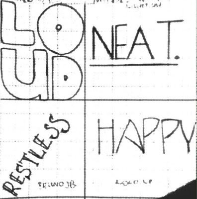
Task 1: Identify 4 words that describe you. You will then express typographically the meaning of these words without the aid of a visual. You are only allowed to manipulate the type to express the inherent meaning of the chosen words.

Draw two 7cm squares on an A4 graph paper using a pencil. Ensure the boxes are centered vertically and horizontally in the A4 paper. Do the same for two other sheets of paper to obtain 4 squares in total.

Draw and express you respective words. Upon approval digitize your artworks using Adobe Illustrator and print them out. Update your eportfolio throughout the task and ensure every aspect of the process is documented methodically.

Marking criteria: Your work will be judged on whether you have been able to capture the meaning or action of the chosen words through your designs. The designed words in the type expression task must showcase sensitivity in balance, proportion and composition. It must reflect the inherent meanings of the words. You will be judged on whether you have demonstrated critical thinking and exploration. This evidence must be visible in your postings in the eportfolio and your in-class process work.


Final Submission
Essentially, I stuck with the words I was experimenting with on Illustrator but with a few just a few tweaks. I tried doing other words, but the ideas just weren't flowing through or the designs I envisioned for them didn't come through as I wanted it to. I decided to just work with what I got, I didn't want anything TOO complicated or too much - I went with how sometimes the simplest designs can speak the loudest.


Feedback
Need to remember to work on documenting my process. In future, inspirations can come from my process documentations, not my final output on assignments
Shouldn't have used outline-type family font, it contributed nothing to the word for "observant"


Should have kept it back and white - no colour.

Experience
This was enjoyable, I over thought it at first and it was like I was putting too much on my plate for no reason, so again I reminded myself to keep it simple. I like the little tweaks and use of symbol, composition and weight through the font of my work.

Observation
This task had more breathing space to be creative with what is already there - no more pressure of structure like the last task. At one point I was being too indecisive and couldn't make up my mind on what to do. I hope I nailed it though! One of the things that keep me stagnant is when I over think about if it could be better.  

Findings
Illustrator is becoming much easier! I'm slowly feeling as confident as I do on Photoshop. I kinda wish I knew how to use this and more when I was doing Advertising Design - like I wonder if it would've enhanced my work. 

Friday, 12 February 2016

Typography - Week 4

Lecture

We started off showing each other our final outcome of our task 2 assignment to give and receive each other's feedback on our work. 

- Ed Fella

We learned about different families of fonts:

1. Serif
2. Sans Serif
3. Display
     - The assignment we had just worked on fall under the "Display" category. 
     - Display fonts are not suitable for body texts.  
4. Script
     - "Script fonts should never be used in all capitals"- SAME goes with "text" fonts.
5. Text
6. Mono-spaced
7. Dingbats

Font - The individual font or weight within the typeface e.g. Bold/Italics

Typeface/Type family/ Font family - Refers to the entire family of fonts that share similar characteristics e.g. Times New Roman

Type expression (20%)
Task 1: Identify 4 words that describe you. You will then express typographically the meaning of these words without the aid of a visual. You are only allowed to manipulate the type to express the inherent meaning of the chosen words.

Draw two 7cm squares on an A4 graph paper using a pencil. Ensure the boxes are centered vertically and horizontally in the A4 paper. Do the same for two other sheets of paper to obtain 4 squares in total.

Draw and express you respective words. Upon approval digitize your artworks using Adobe Illustrator and print them out. Update your eportfolio throughout the task and ensure every aspect of the process is documented methodically.

Marking criteria: Your work will be judged on whether you have been able to capture the meaning or action of the chosen words through your designs. The designed words in the type expression task must showcase sensitivity in balance, proportion and composition. It must reflect the inherent meanings of the words. You will be judged on whether you have demonstrated critical thinking and exploration. This evidence must be visible in your postings in the eportfolio and your in-class process work.

(2-3 weeks)

0.5 stroke width

10 pt, 1.15 spacing

Primary Research:

I worked backwards and sketched out random words that I think related to me and played around with how they should be written like. Out of four, two of them matched fonts that were available from the font file. (The first two, I expected that the last two were not going to match anything but It was fun doodling anyways)

After matching the first two words, I explored through the file and had my mind set on two other fonts that I *attempted* to copy via hand. (1. Achen Std-Bold 2. Antique Oliu Std - Light 3. Bruno JB 4. Kolo)


.....And then out of curiosity, I started installing fonts that I liked but didn't feel like sketching out by hand, so I carried it out on illustrator. My favourite one is so far is "Fusaka Std"


Secondary Research:

My secondary research is pretty much just wanting to see a wider scope of how typography can be used, artistically - and that took me from arabic letters used in a painting to draw a dancing (man?)


To how, even legendary rock bands had the help of typography to create a stamping image of their name and what they're known for.


To street artists that used typography to create their artistic vision. 


I find that I particularly like "symbolic" looking typefaces that takes time to decipher, like a secret language.  


Feedback

- Ask questions days before deadline, not last minute
- Take clear photos, deduction of marks if they are not
- Only put the full instructions on the day the task is given
- One week = one post

- My "H" and my "A" looked too similar, needs more distinction
- Too thin.. hairline thin
- Should have found a pen stroke thinner than how I wrote it out by hand, but thicker than how I did it on Illustrator

Experience:

Experience was alright! Nothing hard (yet). Im anxious for the illustrator work on this though! I'm wondering where this is going.

Observations:

Everything I'm learning in typography is brand new, like who knew letters had so much value to them? I was only aware of how they typefaces aesthetically LOOKED. But the design and process - the "behind the scenes" work is ... another level.

Finding:

I'm happy this assignment is based on actual real typefaces though! It's better for me in terms of having a visual guide and structure to follow.

Wednesday, 3 February 2016

Typography - Week 3

Lecture

Today's class, we jumped right into it. We were individually consulted to figure out what our final designs were. Mr. Vinod instructed us to draw out our final image of our font, only then were we suppose to begin editing it together on Illustrator.

Task 2 (15%): Type Design
You are to design a number of alphabets and punctuations, as determined by the teacher. You will begin by sketching and exploring a minimum of 3 options.
The sketches of the alphabets are to be submitted on A4 graph paper for selection. As always, you will understand, analyse and reflect on the knowledge acquired during the allotted weeks for the task in your ePortfolio.
Starting with the letter “o” design a string of alphabets of similar characteristics. The subsequent letters must spell your name and therefore the characteristics of the letters must represent your personality.
Process:


Final Submission


Feedback:

My feed back on the presentation of my font on Illustrator the first time round, was that I needed to edit my letters a bit more to make it look sophisticated.

Experience:

FRUSTRATING. ILLUSTRATOR IS NOTHING LIKE PHOTOSHOP. The "undo" button and Youtube tutorials were my best friends during this project. I've kind of got a hang of it, but things still disappear randomly when I'm trying to do something, and click the wrong tool - or button. I don't even know what. It just disappears, and I have to figure things out from square one again sometimes.

Observations:


Regardless of the speed bumps, editing work is always fun for me. It was a good learning process for me, creatively. Learning how to create a whole new font according to myself.

Findings:

I want to be better at Illustrator! There are so many tools and I've been seeing different examples of designs that can be achieved so perfectly on Illustrator. I'm looking forward to learning more.