Lecture
We started off showing each other our final outcome of our task 2 assignment to give and receive each other's feedback on our work.
- Ed Fella
We learned about different families of fonts:
1. Serif
2. Sans Serif
3. Display
- The assignment we had just worked on fall under the "Display" category.
- Display fonts are not suitable for body texts.
4. Script
- "Script fonts should never be used in all capitals"- SAME goes with "text" fonts.
5. Text
6. Mono-spaced
7. Dingbats
Font - The individual font or weight within the typeface e.g. Bold/Italics
Typeface/Type family/ Font family - Refers to the entire family of fonts that share similar characteristics e.g. Times New Roman
Type expression (20%)
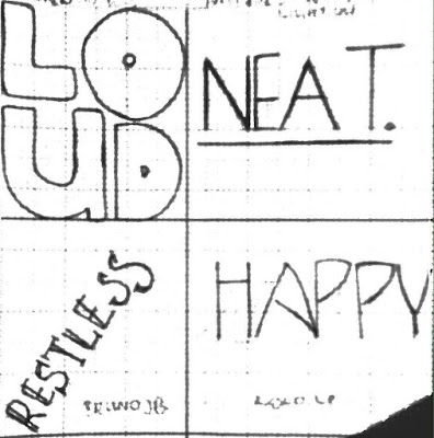
Task 1: Identify 4 words that describe you. You will then express typographically the meaning of these words without the aid of a visual. You are only allowed to manipulate the type to express the inherent meaning of the chosen words.
Draw two 7cm squares on an A4 graph paper using a pencil. Ensure the boxes are centered vertically and horizontally in the A4 paper. Do the same for two other sheets of paper to obtain 4 squares in total.
Draw and express you respective words. Upon approval digitize your artworks using Adobe Illustrator and print them out. Update your eportfolio throughout the task and ensure every aspect of the process is documented methodically.
Marking criteria: Your work will be judged on whether you have been able to capture the meaning or action of the chosen words through your designs. The designed words in the type expression task must showcase sensitivity in balance, proportion and composition. It must reflect the inherent meanings of the words. You will be judged on whether you have demonstrated critical thinking and exploration. This evidence must be visible in your postings in the eportfolio and your in-class process work.
(2-3 weeks)
0.5 stroke width
10 pt, 1.15 spacing
Primary Research:
I worked backwards and sketched out random words that I think related to me and played around with how they should be written like. Out of four, two of them matched fonts that were available from the font file. (The first two, I expected that the last two were not going to match anything but It was fun doodling anyways)
I worked backwards and sketched out random words that I think related to me and played around with how they should be written like. Out of four, two of them matched fonts that were available from the font file. (The first two, I expected that the last two were not going to match anything but It was fun doodling anyways)
After matching the first two words, I explored through the file and had my mind set on two other fonts that I *attempted* to copy via hand. (1. Achen Std-Bold 2. Antique Oliu Std - Light 3. Bruno JB 4. Kolo)
.....And then out of curiosity, I started installing fonts that I liked but didn't feel like sketching out by hand, so I carried it out on illustrator. My favourite one is so far is "Fusaka Std"
Secondary Research:
My secondary research is pretty much just wanting to see a wider scope of how typography can be used, artistically - and that took me from arabic letters used in a painting to draw a dancing (man?)
To how, even legendary rock bands had the help of typography to create a stamping image of their name and what they're known for.
To street artists that used typography to create their artistic vision.
I find that I particularly like "symbolic" looking typefaces that takes time to decipher, like a secret language.
Feedback
- Ask questions days before deadline, not last minute
- Take clear photos, deduction of marks if they are not
- Only put the full instructions on the day the task is given
- One week = one post
- My "H" and my "A" looked too similar, needs more distinction
- Too thin.. hairline thin
- Should have found a pen stroke thinner than how I wrote it out by hand, but thicker than how I did it on Illustrator
Experience:
Experience was alright! Nothing hard (yet). Im anxious for the illustrator work on this though! I'm wondering where this is going.
Observations:
Everything I'm learning in typography is brand new, like who knew letters had so much value to them? I was only aware of how they typefaces aesthetically LOOKED. But the design and process - the "behind the scenes" work is ... another level.
Finding:
I'm happy this assignment is based on actual real typefaces though! It's better for me in terms of having a visual guide and structure to follow.


No comments:
Post a Comment