Wednesday, 6 April 2016

Typography - Week 12

Lecture 
We spent the lecture receiving our last session of feedbacks from Mr. Vinod, according to our latest mock-up and spent the time editing our work to be ready by next week's submission deadline. We were also taught to look up dadaism, modernist, classical and contrast works of art.
Instructions
Task 2 (20%): The BookletYour task requires you to come up with 10-12 lines about your self. The lines can vary in the number of words (1 word, 5 words, 10 words). These lines will be arranged and expressed according to their meanings. Utilize the knowledge gained in all the tasks previously and express yourselves.The booklet you are creating has 8 pages in all (2 A4 sheets stuck together and divided into halves). The format of the booklet is an accordion fold and affixed on either end with a card-board.You have to compose your lines on the various pages, using a variety or appropriate fonts/typefaces, and then considering the size, impact of the respective artworks, place them in an appropriate sequence to ensure a healthy variation from page to page.A demonstration of this shall be conducted in class. How to fold, how to create your illustrator template and how to place the typographic artworks (expressions of the different lines) in illustrator.You will submit, a hardcopy print out and upload the respective JPEGs of the 8 pages in spreads of 2 onto your eportfolio.Marking Criteria: Your work will be judged on whether you have been able to express the meaning of your sentences through your typography and layout (arrangement). The layouts must showcase sensitivity and creativity in the choice of font, its arrangement, its relevancy and its suitability in context of the sentences. It must reflect and enhance the inherent meaning of the sentences.You must look at the arrangements for all the pages and decide whether the pages look like a cohesive unit, whether there is a level of consistency or variation, so as to avoid monotony or over-consistency.You will be judged on whether you have demonstrated critical thinking and exploration, research capability, ability to chronologically document your process and reflect on your journey. This evidence must be visible in your postings in the eportfolio and your in-class process work.Duration: 3 weeksDeadline: week 13

Process:


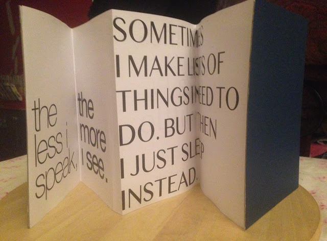
  • My main process in terms of editing was mainly to play around with the words on my page 3b until the words looked the most appealing in a certain composure and to also bring the words to take up HALF of the page, in contrast to the page before.


Final Submission


Feedback:
My feedback thus far mainly consisted of doing a better job at cutting. The advice was to firstly, always have a knew blade when cutting. Then, when cutting, the first slice must start lightly, and then make my way heavier on the page. It creates a cleaner cut.My Folding was off as well (and I figured out why)One of my pages (page 3b), needed editing to look more appealing and was advised to take up half of the page as appose to the whole, in contrast of the page before.

Experience:
My experience doing this project consisted a lot of reflecting on past assignments that we have done collectively that led up to this. It meant piecing together everything I have learnt to present in this booklet and with that I enjoyed so. To see actual results of work I have accomplished, without realising how much I've learnt is motivating.

Observations:
Throughout this whole assignment, I observed my changes of judgment in design maturing. I am able to be more specific in my choice of font types and how to compose them in terms of size, shape, placement and space. 


Findings:
I have found a whole knew perception on words and font types used in the media. Knowing more about the history back ground of letters and how they came about gave my view on them new value. I find myself automatically wondering what the font of letters are being used when I read advertisements or watch a new commercial. I wonder or automatically try to figure out the thought process behind the particular design of letters being used in advertising other media platforms, what I would change and what could be more complementing instead, it's interesting. 

Wednesday, 30 March 2016

Typography - Week 11

Lecture 
This period we had to show our mock-ups and received individual feedback from Mr. Vinod. We were then asked to continue editing and perfecting out work from the said feedback. 


Feedback:
I was told to use 4 fonts throughout my whole booklet, just so it visually flows better. My use of more than four fonts made it look "too much."

My "I prefer my own space" image needed to be decreased, to compliment the statement. 

"SOMETIMES I MAKE LISTS OF THINGS I NEED TO DO. BUT THEN I JUST SLEEP INSTEAD." needed to be increased and adjusted according to space.

"The less I speak, The more I see." needed their fonts changed.

"I think a lot." needed a font change as too.

"Maybe sometimes a little too much" needed font and placement adjustments.

Experience:
My experience doing this work was pleasant. I had a clear idea of the impression I aimed to give, through out my work, my feedback specifically only curved me to refine my vision. 


Observations:
This assignment had the least bit of criteria to follow, I like the element of personalisation we were allowed to work with, and make a booklet out of.

Findings:
The hardest part of this whole assignment was one of my pages where I had a statement that I wanted to break up and have each part placed horizontally or vertically. It took awhile to find a composition that was most appealing to eye.

Wednesday, 23 March 2016

Typography - Week 10

Lecture 

This lecture was based on the introduction of a new assignment. A demonstration was shown on how to make the booklets we will have to be designing. Then, Mr. Vinod moved on to show us how to design a booklet on illustrator, their sizes, margins and how to refer to your physical mock up, from the soft version on Illustrator.

The last part of our lecture was for us to receive our feedbacks on our letter assignment. 

Instructions:

Task 2 (20%): The Booklet

Your task requires you to come up with 10-12 lines about your self. The lines can vary in the number of words (1 word, 5 words, 10 words). These lines will be arranged and expressed according to their meanings. Utilize the knowledge gained in all the tasks previously and express yourselves.

The booklet you are creating has 8 pages in all (2 A4 sheets stuck together and divided into halves). The format of the booklet is an accordion fold and affixed on either end with a card-board.

You have to compose your lines on the various pages, using a variety or appropriate fonts/typefaces, and then considering the size, impact of the respective artworks, place them in an appropriate sequence to ensure a healthy variation from page to page.

A demonstration of this shall be conducted in class. How to fold, how to create your illustrator template and how to place the typographic artworks (expressions of the different lines) in illustrator.

You will submit, a hardcopy print out and upload the respective JPEGs of the 8 pages in spreads of 2 onto your eportfolio.

Marking Criteria: Your work will be judged on whether you have been able to express the meaning of your sentences through your typography and layout (arrangement). The layouts must showcase sensitivity and creativity in the choice of font, its arrangement, its relevancy and its suitability in context of the sentences. It must reflect and enhance the inherent meaning of the sentences.

You must look at the arrangements for all the pages and decide whether the pages look like a cohesive unit, whether there is a level of consistency or variation, so as to avoid monotony or over-consistency.

You will be judged on whether you have demonstrated critical thinking and exploration, research capability, ability to chronologically document your process and reflect on your journey. This evidence must be visible in your postings in the eportfolio and your in-class process work.

Duration: 3 weeks
Deadline: week 13


Process:

Showing Vidi what she missed out on and how to make the booklet.


This is what I came up with so far! I like it much better than my previous type expression assignment. This is just a mock up, so it's likely to change by the time I get to the final version.


I underestimated how much TIME printing would take -__-
trying... and re trying.... 


Experience:

So far, it was just the printing that was hard. I can't even explain why. Printing back-to-back on a one side printing printer, just made it confusing. It either came out upside down on the other side, or something went wrong with the words. Sometimes I one thing right, and another thing wrong. Then apparently my printer has a "cooling down" period that I was not aware of. So that took awhile too.

Observations:

Working on this booklet made me realise how helpful it was to get through all the previous assignments. It all makes sense now and it made the task easier than it would have been if I had not paid attention to the previous tasks. I had no troubles with Illustrator this time round, my experience with assignment so far has been manageable. I'm looking forward to perfecting my design as the deadline for my final outcome approaches.
Findings:

I love working with my hands, so to finally get the chance to use tools and MAKE booklet was great. I liked being intricate with the bends of the papers, lining up the two pages. It isn't hard, but it was fun to do. Makes me wish I was a design student. I'm definitely planning to do this again in my own time to create more personal work, probably even with more pages next time! AND COLOUR! 


Wednesday, 16 March 2016

Typography - week 9

Lecture 

We started out with a lecture. It was mostly based on how to use quotations and how to use them and formatting of paragraph styles.

The Chicago Manual of Style - 16th edition (if you're planning to work in the media industry :THIS IS YOUR BIBLE

Right after our lecture, we moved on to looking over everyones progress in their letters so far to receive our individual feedbacks.

Primary Research:

I made sure that I finalised the font families I wanted to use during my first round of my process, so after I received my feedback, I edited in the little changes I had to make like margins, putting in my address, etc.


Final Submission

I chose this as my final submission because I liked the typeface I used. It looks romantic and gives off the opposite impression to what the "writer" is writing. I wrote this letter from a hypothetical character that I created. She is someone that has troubles expressing her emotions and runs around ever actually saying the words "I miss you". Though her words are stern and hardly loving, I wanted to feed the impression that she doesn't really mean it, through her handwriting.

Secondary Research:

I had a fun conversation with my parents about writing letters during their time. It didn't do much for the outcomes of my final work but it got me to understand and feel more about the time when letters were the main way of communicating through long distance. It wasn't just about margins and alignments, but it required enough care for the consciousness of creating a good presentation. Presentation carried a lot of (subtle) value.

My dad told me stories about how he would put petals or a little bit of a sent on a page, just for an extra touch. 

Feedback:

My feed back was mainly to be mindful of my alignments, one of my letters looked like a poem. I also learned that paragraphs were not necessarily needed to be spaced out, but once a paragraph had an index, that that was enough. 

My sign-off was advised to be changed. 

and a reminder to insert in my address as well, on the right side.
And the receiver's address on the left.


Feedback:
On my letter assignment, my final feedback on the outcome was the size of my words. I forgot to take into account that the font type would affect what size I put them at. With the font that I used, I should've made it bigger.

Also, my ragging still needed fixing.
Experience:

It was nostalgic to work on an assignment to do with letters, It reminded me of when I was younger and still in school - learning about how to write a letter and about what goes where. It's funny to realise that with this assignment, I'm doing the same thing, but on an advanced level and at a different time. 

Comparing how my letters were written then and how I am writing it now, makes me see the apparent changes and the differences in the processes of it. 
We went from using pencil and paper - to typing on Adobe Illustrator and printing our letters. 

Observations:

I enjoyed this assignment because apart from it being about formatting a love letter, we had to actually write one. This kicked my creative writing into gear and I got to play around with it a little bit. I wrote the letter coming from a stubborn workaholic. Some one who has troubles admitting that she is wrong and doesn't enjoy showing her affection so much. I'm hoping I successfully achieved that impression.

Findings:

I found myself wondering more about writing letters, I wish I had the chance of experiencing the excitement of writing and receiving letters. There's just an absence of depth in technological communication, that letters have. Or maybe I just like writing. 

I've always thought of getting on to writing letters as a random hobby, but NOBODY WRITES LETTERS ANYMORE.

Wednesday, 9 March 2016

Typography - Week 8

Lecture 

It as a Saturday replacement class. Essentially it was a session of critiquing each other's ad. And then was given the instructions for the next assignment.


Type arrangement (30%)
Task 1
 (10%): The Letter
In this task, you will write (type) a single page love letter to your beloved who has been abroad for the last 6 months. The year is 1986, the world wide web or internet isn’t yet available to the masses, however the desktop computer has been invented. Letters are still a popular means to send and receive news. As, such it has been your practice to write one letter a week on your new desktop computer, print it, seal it in an envelop and post it to your beloved. This single page letter must be written sensibly and sensitively.
Your task is to use Adobe Illustrator to format this letter in a classical letter writing format (in the days of old) – when letter writing was done by hand – using a suitable font (or a combination of fonts), and appropriate margins, alignment, point size, leading and line length.
You will be required to print two copies; one without creases or folds, the other for postage. The letter for posting will require an envelop, as such thought must be put into the writing of the address on the envelop. You will post this letter to yourself, and you will bring this letter to class for submission and discussion. You will as always document all the processes, drafts and the final results on your eportfolio.
old-letter Alice-Jackson-StuartkfkhWIb Palmer_Method_sampleRoyal letter 
Above: Classical letter samples
(Note* If you stumble on some additional references, do share the on our Facebook group).
Marking Criteria: Lorem Ipsum…
Duration: 2 weeks
Deadline: week 10

Primary Research:

I came up with 3 drafts as possible final outcomes:

Cedarville Cursive

Nimbus Mono

Popsies

Secondary Research:


Feedback:

My feedback from the last assignment was to mainly be more aware of my sizing, because I got that wrong. 

Experience:

I had fun writing the letter. It was the easiest part to accomplish, once I figured out how to compose the whole piece. I cultivated a character to write the letter from. I look forward to posting it, to myself. 

Observations:

I find this assignment to be the most fun so far. This time I went outside my options of font families available on my laptop and searched for some online. It took awhile to find hand writing's/font types that were able to portray my letter the way I saw fit, in 3 different ways. 

Findings:

It was a little hard for me to find old love letters from the 1980's. I found a few, that were unreadable. For inspiration, I reverted back to the "love" letters that were used as example for the assignment, in the instructions.  It was interesting to find that none of them were "love letters" at all. 

One of them was a letter about a student wanting to withdraw from her law course.
And another was a letter from the first African-American female who went to university in America.

This was when I figured the interesting illusion of a "love letter". Noticing that the examples were not actually love letters, made me be more aware of how to make a letter look romantic (or whatever tone I wanted to show) by it's presentation.


Wednesday, 2 March 2016

Typography - Week 7

Lecture 

Started the class with general feedback about the class's overall work, then we went through the presentation of the lesson and finally we worked through Illustrator 
Body copy should be size 9-12, depending on font used, the audience and the width of the column.

·      Widows
-   When the last line – one line or less -  is in the second column.

·      Orphans
-   When the beginning – one line of it or less - of a new paragraph starts in the previous column.

·      Leading and line spacing mean the same thing – refers to the amount of space between lines of type.
-   Always 2 point or 3 points larger

·      Kerning
          - Adjusts the width of space between two characters

·      Tracking
-   The adjustment of word spacing

·      Flash left/rag right
-   Do not right align if you a large body text

*Always have MARGINS*

Primary Research:

bought and tried out the product:
  • Price: RM5
  • I liked the packaging! 
    • Attractive overal color - Red
    • Easy to open
    • Interesting shape
    • I like that the cover of the product is gold, it's makes the product a striking image
      • Gold - impression of wealth
        • Caters to minor physical health issues 
        • Reminds me of the quote "Health is Wealth"
  • Experience using the product:
    • Feels minty
    • Unsure if it healed anything
      • But the sensation the product leaves a strong minty feeling that numbs the area it's spread on. 
      • I can see how it would help minor pains like sprained ankles, headaches, pains associated with muscles and joints, etc.


Secondary Research:


Similar ads I found to be helpful,
 just to add to the examples I had blogged in my previous post:


Process:


Feedback:
Too fast to digitise the art
Two key words – FEEL and HEAT

Utilise what we learnt in the previous assignments

Without the small spiral, you can’t get through the bigger one

1) Go and experience the product
2) Understand the product
3) Look at the previous ad’s of the product
4) Look at ad’s that offer similar kind – using only type/words
5) THEN SKETCH
6) THEN ILLUSTRATE

You process reflects your thinking.

No water mark
Work on headline
The headline leads to the body copy


Final Submission

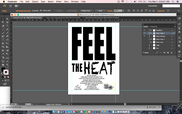
The two main font families I used in this ad was “Impact” and “Chalkdust”. I used Impact because it was what I thought was the closest that looked like the typeface used for the title of the brand, “Tiger Balm”. I was looking for consistancy first. Then I kerned the letters in the word “FEEL” a little bit apart and made the word huge enough to cover almost half of the page, to express calmness. Something that I thought an audience would relate the word “FEEL” with. I also wanted to the word to demand attention, as is the poster is TELLING the reader that they MUST FEEL. After, I used “Chalkdust” to express the word “HEAT” because the style of it made the letters look burnt. I aimed for “Heat” to have a look that did not look like the rest of the words on my ad because I wanted my audience to believe in the word “Heat", making it a significant feature of the product. Like this medicine will do its job to sooth basic body pains through it’s heat. Overall I wanted both the words "Feel" and "Heat" to attract attention, but in different ways. 

Experience:


I hate how the boxes around the different elements on your dashboard on Illustrator overlap each other. I spent hours trying to select the body text or the headline and I kept having to shift words or pictures around when they have already been perfectly placed.
Observations:

I always wondered how people know the name of font families so distinctively. Because finding the perfect font to express the headline was the central theme of this assignment, I started to remember the names of font families too. I changed them around a lot and within the first few rounds of editing I didn't know the fonts available enough to compare which would suit the words best. It was a long road, but I got there eventually.
Findings:


In contrast to the last assignment, I hated Illustrator this time. Just the difficulty of navigating my components around my dashboard made it all frustrating and took ages. Maybe my Illustrator is a bit weird because it's fake, I don't know.