Started the class with general feedback about the class's overall work, then we went through the presentation of the lesson and finally we worked through Illustrator
Body copy should be size 9-12, depending on
font used, the audience and the width of the column.
· Widows
- When
the last line – one line or less - is in the second column.
· Orphans
· Leading
and line spacing mean the same thing – refers to the amount of space between
lines of type.
- Always
2 point or 3 points larger
· Kerning
· Tracking
- The adjustment of word spacing
· Flash
left/rag right
- Do
not right align if you a large body text
*Always
have MARGINS*
Primary Research:
I bought and tried out the product:
- Price: RM5
- I liked the packaging!
- Attractive overal color - Red
- Easy to open
- Interesting shape
- I like that the cover of the product is gold, it's makes the product a striking image
- Gold - impression of wealth
- Caters to minor physical health issues
- Reminds me of the quote "Health is Wealth"
- Experience using the product:
- Feels minty
- Unsure if it healed anything
- But the sensation the product leaves a strong minty feeling that numbs the area it's spread on.
- I can see how it would help minor pains like sprained ankles, headaches, pains associated with muscles and joints, etc.


Secondary Research:


Similar ads I found to be helpful,
just to add to the examples I had blogged in my previous post:


Process:


Feedback:
Too fast to digitise the art
Utilise what we learnt in the previous assignments
Without the small spiral, you can’t get through the bigger one
1) Go and experience the product
You process reflects your thinking.
No water mark
Final Submission

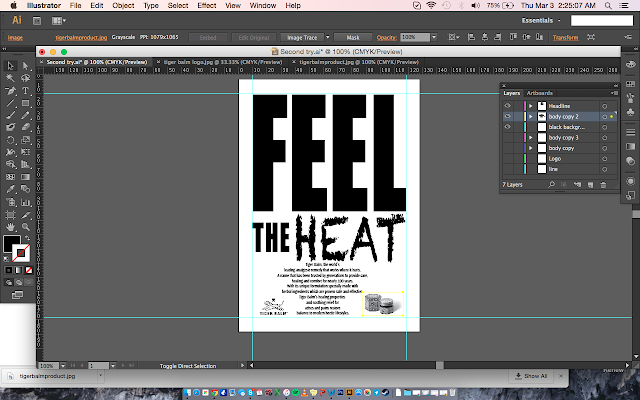
The
two main font families I used in this ad was “Impact” and “Chalkdust”. I used Impact
because it was what I thought was the closest that looked like the typeface
used for the title of the brand, “Tiger Balm”. I was looking for consistancy
first. Then I kerned the letters in the word “FEEL” a little bit apart and made the word huge enough to cover almost half of the page, to
express calmness.
Something that I thought an audience would relate the word “FEEL” with. I also wanted to the word to demand attention, as is the poster is TELLING the reader that they MUST FEEL. After, I
used “Chalkdust” to express the word “HEAT” because the style of it made the
letters look burnt. I aimed for “Heat” to have a look that did not look like the rest of the words on my ad because I wanted my audience to believe in the word “Heat", making it a significant feature of the product. Like this medicine will do its job to sooth basic body
pains through it’s heat. Overall I wanted both the words "Feel" and "Heat" to attract attention, but in different ways.
Experience:
I hate how the boxes around the different elements on your dashboard on Illustrator overlap each other. I spent hours trying to select the body text or the headline and I kept having to shift words or pictures around when they have already been perfectly placed.
Observations:
I always wondered how people know the name of font families so distinctively. Because finding the perfect font to express the headline was the central theme of this assignment, I started to remember the names of font families too. I changed them around a lot and within the first few rounds of editing I didn't know the fonts available enough to compare which would suit the words best. It was a long road, but I got there eventually.
Findings:
In contrast to the last assignment, I hated Illustrator this time. Just the difficulty of navigating my components around my dashboard made it all frustrating and took ages. Maybe my Illustrator is a bit weird because it's fake, I don't know.


Similar ads I found to be helpful,
just to add to the examples I had blogged in my previous post:


Process:
Feedback:


Final Submission

The two main font families I used in this ad was “Impact” and “Chalkdust”. I used Impact because it was what I thought was the closest that looked like the typeface used for the title of the brand, “Tiger Balm”. I was looking for consistancy first. Then I kerned the letters in the word “FEEL” a little bit apart and made the word huge enough to cover almost half of the page, to express calmness. Something that I thought an audience would relate the word “FEEL” with. I also wanted to the word to demand attention, as is the poster is TELLING the reader that they MUST FEEL. After, I used “Chalkdust” to express the word “HEAT” because the style of it made the letters look burnt. I aimed for “Heat” to have a look that did not look like the rest of the words on my ad because I wanted my audience to believe in the word “Heat", making it a significant feature of the product. Like this medicine will do its job to sooth basic body pains through it’s heat. Overall I wanted both the words "Feel" and "Heat" to attract attention, but in different ways.
Experience:
Observations:
Findings:
In contrast to the last assignment, I hated Illustrator this time. Just the difficulty of navigating my components around my dashboard made it all frustrating and took ages. Maybe my Illustrator is a bit weird because it's fake, I don't know.
No comments:
Post a Comment