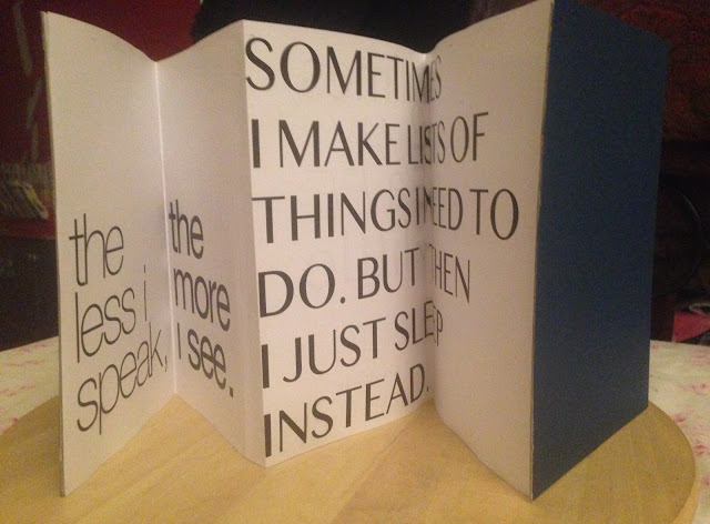
This period we had to show our mock-ups and received individual feedback from Mr. Vinod. We were then asked to continue editing and perfecting out work from the said feedback.
I was told to use 4 fonts throughout my whole booklet, just so it visually flows better. My use of more than four fonts made it look "too much."
My "I prefer my own space" image needed to be decreased, to compliment the statement.
"SOMETIMES I MAKE LISTS OF THINGS I NEED TO DO. BUT THEN I JUST SLEEP INSTEAD." needed to be increased and adjusted according to space.
"The less I speak, The more I see." needed their fonts changed.
"I think a lot." needed a font change as too.
"Maybe sometimes a little too much" needed font and placement adjustments.
Experience:
My experience doing this work was pleasant. I had a clear idea of the impression I aimed to give, through out my work, my feedback specifically only curved me to refine my vision.
Observations:
This assignment had the least bit of criteria to follow, I like the element of personalisation we were allowed to work with, and make a booklet out of.
Findings:
The hardest part of this whole assignment was one of my pages where I had a statement that I wanted to break up and have each part placed horizontally or vertically. It took awhile to find a composition that was most appealing to eye.

No comments:
Post a Comment